
A sourcing guide from the supplier side — because the more you know before you order, the better the result for both of us
Most of the clients we work with come to us after a bad experience somewhere else. The canvas was lighter than quoted. The print bled on the first wash. The supplier went quiet after payment. We hear these stories often enough that we stopped being surprised — and started putting together the kind of guide we wish every buyer had read before their first order.
This isn’t a pitch. If anything, it’s the opposite — we’d rather spend five minutes helping you understand what to look for than spend three weeks managing a dispute over a run that went wrong. So here’s what we actually tell new clients, from the beginning.
1. Why the Bag Matters as Much as the Print
The canvas choice your printer won’t always tell you about
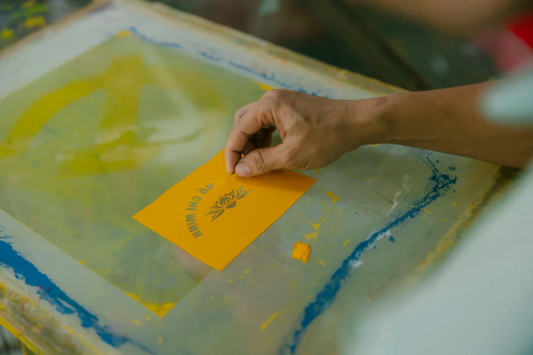
When a screen printing project goes wrong, everyone looks at the print first. Wrong color, soft edges, ink peeling after a few washes. Nine times out of ten, the problem started with the bag — not the press.
Cotton canvas is the only material we’d recommend for screen printing at any serious volume. Not because we only sell canvas — but because the chemistry is simply better. Water-based ink bonds with woven cotton at a fiber level. It doesn’t sit on top of the material waiting to peel; it becomes part of it. The same ink on a non-woven polypropylene bag — the kind that looks similar in photos — will start degrading after a handful of washes. We’ve seen clients come to us with exactly this problem after sourcing from the wrong place.
The other thing canvas does well: it holds registration. A consistent weave means consistent ink placement across a bulk run. When you’re printing 1,000 units and you need every logo to land in the same position, the surface stability of woven canvas is what makes that possible.
Weight: the spec most buyers underestimate
Canvas weight — measured in ounces per square yard — is the single variable that most influences both print quality and product feel. Here’s how we explain it to new clients:
10oz is what you see in most promotional giveaway bags. It prints acceptably for bold, simple artwork. We recommend it for high-volume orders where cost efficiency matters more than print precision. If your design has fine lines or more than two colors, we’ll usually suggest going heavier.
12oz is our most commonly specified weight, and for good reason. It’s versatile — it handles multi-color designs cleanly, feels substantial enough to be kept and reused, and sits at a price point that works for most B2B budgets. When a client asks us what to order and doesn’t have a strong preference, this is where we start.
14oz and above is where we direct clients who want the bag to feel like a retail product rather than a promotional item. The weave is dense enough that ink edges are noticeably sharper. Colors reproduce with more accuracy. The finished product feels different in hand — in a way that’s immediately apparent to whoever receives it. If the bag is part of your brand experience rather than just a vehicle for a logo, this weight earns its premium.
One thing we always flag with new clients: specify pre-washed canvas. Untreated cotton shrinks 5–8% after the first wash. That doesn’t sound dramatic until your 12-inch centered print arrives slightly off after the first laundry cycle. Pre-washed canvas is a standard option with any quality supplier. If a supplier doesn’t mention it, ask.
2. What Happens When the Colors Don’t Match
This is the conversation we have more than any other. A client approves a digital mockup, the order arrives, and the colors are off. Not dramatically wrong — just not quite right. And nobody is sure whose fault it is.
Here’s the honest answer: it’s usually a file preparation issue, and it’s almost always preventable.
The three color systems that don’t speak to each other
Your logo exists in RGB — the color mode of screens. The mockup your designer sent was built in RGB or CMYK. Screen printing uses Pantone inks — a physical ink mixing system with its own numbering. These three systems don’t automatically translate.
When we receive artwork without Pantone specifications, we have to interpret. Our press operators are experienced — they’ll get close. But “close” is not the same as “matched to brand standard.” For clients with established brand guidelines where color accuracy matters, we always ask for Pantone codes before we make screens. It adds one conversation to the process. It eliminates a whole category of problems.
If you don’t have Pantone codes for your brand colors, it’s worth having your designer identify them now — before you brief any supplier, not after.
The dark canvas conversation
Printing on dark or colored canvas is something we do regularly, but it comes with a step that surprises some buyers: the white underbase.
When you print a light or bright ink color onto dark fabric, the fabric base color shows through and shifts everything. A yellow logo on a navy bag looks green. The solution is to print a white ink layer first — a base that gives subsequent colors a neutral ground to sit on. This adds one screen to the job and one pass through the press. On a quote, it appears as an additional color.
We mention this upfront because some suppliers don’t — and buyers discover it when a two-color quote becomes a three-color invoice. If you’re planning to print on anything darker than natural canvas, ask your supplier about underbase requirements before the quote is finalized.
3. The File Conversation (We Have This One a Lot)
Why we always ask for vectors
Every week we receive artwork submissions that aren’t print-ready. Usually it’s a PNG or JPEG that looks fine on a screen but will produce soft, pixelated results when turned into a screen. We ask for the vector source file. Sometimes the client has it. Sometimes they didn’t know it existed.
Vector files — AI, EPS, SVG — are built from mathematical paths rather than pixels. They scale to any size without any loss of precision. When we use a vector to cut a screen, the stencil edge is clean. When we use a raster file, it’s a compromise — and the compromise shows up in the print.
If you’re working with a designer, ask them specifically for the vector source file before briefing us. Not the exported PNG. The actual .ai or .eps. It’s a five-second conversation that prevents a production delay.
What the mesh can and can’t do
Screen printing has physical limits that digital design doesn’t. The mesh that carries ink has a thread count — and anything finer than that count allows will bleed or drop out.
In practical terms: lines thinner than 0.5pt are risky. Small text under 8pt often becomes illegible. Complex photographic images don’t translate directly — they need to be converted to halftone dot patterns, which approximates tonal range within a single ink color. It works well for the right kind of artwork. It doesn’t look like a photograph.
We tell clients this not to limit what they can do — but because a design that works with screen printing’s strengths consistently produces better results than one that fights against them. Bold, graphic, clean. That’s the aesthetic that this process does best.
4. How Pricing Actually Works
We get asked about pricing before almost anything else. Which is fair — budget matters. But per-unit price without context is almost meaningless, so here’s how we explain the structure.
Setup cost and production cost are two different things
Every screen printing job has two cost components. Setup covers making the screens — one per color, per print location. It’s a fixed cost, paid once for a given design. Production is the per-unit cost — the bag plus the printing.
At low quantities, setup cost represents a large share of what you pay. At 500 units, it can be 20–30% of the total invoice. At 1,000 units or more, it becomes almost invisible. This is why screen printing gets dramatically more cost-efficient as quantity increases — the fixed cost is spread across more units, and the per-unit production cost falls at the same time.
The practical implication for clients: if your budget allows you to consolidate two smaller orders into one larger one, the savings are real. And if you’re planning to reorder the same design, most suppliers — including us — waive screen setup fees on repeats. Your screens are already made. That makes subsequent orders meaningfully cheaper than the first.
The five variables that actually determine your quote
Beyond quantity, five factors drive the final price of any wholesale canvas tote bag order:
Canvas specification — heavier canvas costs more per unit, but produces better print results and a better end product. The premium for 14oz over 10oz is usually 20–35%.
Color count — each additional ink color adds a screen setup fee and press time. Two colors costs less than four, always.
Print locations — front only is standard. Back panel, side gusset, and handle imprints each add setup and production cost.
Certification requirements — OEKO-TEX and GOTS certified canvas carries a premium. For clients selling into EU or premium retail, this is often non-negotiable. For internal event use, standard canvas is typically sufficient.
Zeitleiste — standard production runs 10–15 business days from artwork approval. Rush orders under seven days carry a 15–30% premium, depending on capacity.
5. What We Check Before We Approve Any Bulk Run
The sample conversation
We require a pre-production sample approval on every new order. Not because we don’t trust our production team — but because the sample stage is where we catch the things that are easier to fix before full production runs than after.
A physical sample does two things. It confirms the bag specification — you can feel the canvas weight, check the stitching at the handle attachment point, verify the print face dimensions against your artwork. And it confirms the print — color accuracy, edge definition, ink coverage, registration. We ask clients to wash the sample five to ten times before approving. If the ink fails that test in pre-production, it would have failed in the customer’s hands. Better to know now.
Some buyers push back on the sample stage because it adds time. We understand — timelines are real. But we’ve never had a client regret the sample step. We’ve had several regret skipping it.
What good quality actually looks like
A well-printed canvas tote bag has a consistent set of characteristics that are easy to assess once you know what you’re looking for.
The ink surface feels slightly raised — present, but not rubbery or stiff. Colors are saturated and accurate to the specified Pantone. Edges are clean, with no ink bleeding into the surrounding weave. Stitching at the handle base uses reinforced bar-tack construction, not straight stitch. The canvas weight feels consistent with the specification — a 12oz bag should feel noticeably denser than a 10oz, and both should feel substantially heavier than any non-woven alternative.
After washing, a properly cured print shows no cracking along fold lines and no fading at the edges. If either appears on a sample, the ink was under-cured or the canvas wasn’t pre-treated. Both are fixable before production. Neither is acceptable in a finished order.
6. The Questions We Wish Every Client Asked Us Earlier
Over time, we’ve noticed the clients who get the best results tend to ask similar questions at the start of the process. Not about price — about fit.
“Is this canvas weight right for my design?”
— A multi-color design on 10oz canvas is a mismatch. We’d rather tell you that before quoting than after producing.
“Do you store screens for reorders?”
— Most quality suppliers do. It affects your total cost over a long-term relationship more than unit price does.
“What certifications does your canvas carry?”
— OEKO-TEX Standard 100 covers chemical safety. GOTS covers organic sourcing. If your end market requires either, confirm before you order.
“What’s your policy if the production run doesn’t match the approved sample?”
— A supplier confident in their quality will have a clear answer. Vague answers here are worth noting.
“Can I mix colors or sizes within a single order?”
— For clients managing multiple SKUs or testing colorways, this flexibility can meaningfully reduce the minimum investment required.
Let’s Talk About Your Project
The clients we work best with are the ones who come to us with clear specs, realistic timelines, and an openness to the sample stage. Not because those things make our job easier — though they do — but because they’re the conditions that consistently produce orders people are genuinely happy with.
If you’re at the stage of putting together a brief, requesting samples, or comparing suppliers — we’re glad to be part of that conversation. The more we understand about what you’re trying to achieve, the better we can tell you whether we’re the right fit, and what the right specification looks like for your project.
Request a sample, share your artwork, or just send us the brief. We’ll take it from there.

 German
 English
 French
 Japanese
 Arabic
 Thai
 Vietnamese
 Russian
 Spanish
 Portuguese